(Update July 30, 2011: Since the original test was published quite a while ago, I have added this link to the outcome of this test. Of course, if you want to give the test a try yourself, you should read the whole article, try answering the questions, and only after that come back here to follow the link to find out how your response compares.)
Yesterday I posted a series of three images in a couple forums I frequent along with a request that a few people try a little experiment with them. Here it is for anyone else who would like to participate.
Below on this page are three images presented at a typical web viewing size. The question has to do with what you see when you look at them in your browser. (Please read some additional material further down that explains why you must only look at the photos in your browser for the purposes of this exercise.) Considering all aspects of the presentation of the images, in the end there are three possibilities:
- all three images seem identical – e.g. there are no perceptible differences among them.
- all three images seem different from one another – e.g. each is visibly unique.
- two images seem identical but one seems unique – e.g. one is visibly different from the other two, and those two seem visibly identical
Before you give it a try, there are a few “conditions and warnings.”
- You could easily cheat by opening the files and looking at EXIF or other data. But don’t. Or if you cannot resist, please keep your observations to yourself. I’ll stipulate that you could find differences in file parameters by looking there – but that isn’t the point in this case.
- You should not assume that I am incapable of modifying EXIF and file size and so forth in ways designed to trick those who “cheat” and inspect the files directly. Nor should you assume that I have. Or that I have not. Or whatever… :-)
- The question is not “are they three separate exposures or one exposure,” so if, for example, you think that the water looks exactly the same in all three images that, in and of itself, isn’t relevant to the question – and your assumptions may or may not necessarily be correct.
- The question is not whether this is a good, bad, or indifferent photograph – I make no claims beyond the fact that it is used here as a test image.
- The question is not “what would they look like at 100% magnification?” Interesting question, but here the question is just about what you see in the images as presented.
- If you think that you see differences among them, the followup question concerns the nature of the visible differences. Note that the follow-up question is not “how might the differences have been produced?” Just describe what you think you see.
- There is no “point” inherent in the exercise, though when I explain more after getting some responses you might or might not draw some of your own conclusions. For now, just compare what you see.
(Follow-up observation. Having access to server logs, it is interesting for me to note the percentage of people who share a response versus the number of page views… ;-)
(Note on 9/10/11: Especially on flat-panel monitors, the position of the image on the screen may create visible differences that are not in the source images. Try to view the samples in the same location on your screen to avoid being misled by this. Once you make your observations and read comments here and in the follow-up post, you may see that others noticed and commented on this.)
I have set this up so that clicking on each image will open it in a new window or tab – though it is a bit awkward in that you’ll need to manually return to this window after doing so. Once they are open in three tabs (best) or windows you can click between them to compare more carefully if you wish – but do stick to viewing them in your web browser since that is part of “the question.”
After viewing, leave a comment stating which option (1, 2, or 3) best describes what you see. In addition, if you select option 2 you might offer a brief explanation of differences you see. (Again, not analysis of downloaded files please! That isn’t the question and it spoils the “game” for other participants. ) If you select option 3 tell us which one is different from the other two and perhaps what you observe about the visual difference.
Here are the images (Click to open each in new windows if you would like – you’ll have to manually return to this window each time – or feel free to view them here “in line.”):
A. 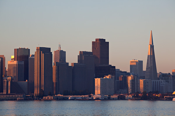
B. 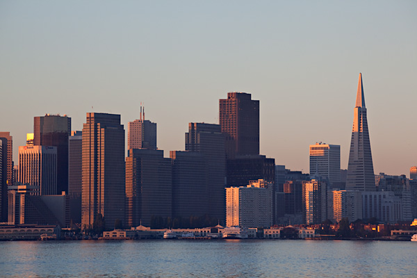
C. 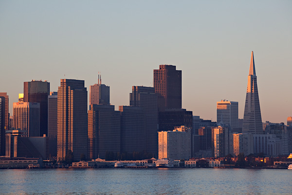
Thanks for participating!
Dan
Chaz – be sure to follow the links and see the results of the little test. I won’t give it away here, but I’ll bet you’ll be interested in what went on behind the test.
Dan
1. All three images seem identical – e.g. there are no perceptible differences among them.
Taking a quick scroll through the images seem sharper going in descending order. There’s some pixelation in the first, that is less in the second and gone in the third.
The specific point of this little test was to consider whether passionate concerns about small differences in resolution are warranted when a photographer will reduce the size of the photograph dramatically for online posting or similar use. While minor differences in sharpness due to factors such as lens or sensor resolution can be important when photographs are produced at very large sizes, they may be completely lost when the photographs are downsized. Another experiment I did produced similar results when the amount of noise was the variable.
With that said, your 20D can produce excellent photographs, as you point out, especially if you are not pushing the upper boundaries of print size.
Dan
Dan,
I thank you for your kind reply.
You made me think:
Well, since you say that, though minimal, there are differences based on sharpness and resizing and that small differences in sharpness are unlikely to be perceptible, I wonder whether there is a true need to use cameras with high megapixel sensors.
In my experience I have rarely made very large posters that exploit the resolution of the camera.
True, more freedom with cropping is a plus, but the smaller the crop the more you are going to see the limitations of the lens, which will inevitably affect results.
In the end, the vast majority of pictures we enjoy and distribute are very often downsized to be appreciated (fully) on monitors.
All this to say that I do not think I will sell my EOS20D (which serves me better than a Canon extender) and that I do not really need to upgrade my ‘slow’ EOS 5D to the mark II series.
Most of all, I hope to keep improving ‘my eye’ and continue to observe the world around me as an endless opportunity to capture beauty.
Thanks again.
Ago
Responding to your post, Ago, might make for a longer message than I want to type right now, so let me give a quick response. The three images, although they started as the same “capture,” are not “identical” as presented here. There are two variations on the image presented in this set of three images.
The important question here is, given the objective differences among them (which are explained in a follow-up post to this one), are observers able to reliably discriminate among the images based on the difference. In order to “succeed” at discriminating among the images, the observer is asked to successfully perform two tasks. First, they must perceive that the images are not identical. (Quite a few people were not able to see anything that seemed different about them.) Second, an in order to reduce the possibility of random results, they have to correctly identify which pair of images are the same. Very, very few people could do this.
The difference between the images had to do with the focus of the image before it was reduced for display at web sizes. In one case the image was very sharp and in the other it was very blurry – much blurrier than you would get from any decent lens.
The thesis (more or less) was that with web-size reductions of high quality photographs, small differences in sharpness are unlikely to be perceptible. The results are not inconsistent with that idea.
Take care,
Dan
WITH ME ARE REPLIES 1, 8, 9, 11, 13, 24.
OUT OF A TOTAL OF 31 ANSWERS, THIS IS A 19%.
ABOUT 1 IN 5 THINKS THAT THERE ARE NO DIFFERENCES.
INTERESTING
The three images are identical.
Each one is visibly unique when appreciated as a single visible image.
1. all three images seem identical THEY ARE – e.g. there are no perceptible differences among them. BECAUSE IT IS THE SAME IMAGE (The sea has the same waves in all three pictures and there are no obvious differences in exposure and all).
2. all three images seem different from one another – e.g. each is visibly unique. CORRECT AS STATED: THEY ARE THREE INDIVIDUAL REPLICAS WHICH CAN BE OBSERVED SEPARATELY
3. two images seem identical but one seems unique – e.g. one is visibly different from the other two, and those two seem visibly identical EACH PICTURE CONSIDERED SINGULARLY IS DISTINCT FROM THE OTHER TWO. AND THE OTHER TWO, WHEN LOOKED AT (visibly), DO SEEM IDENTICAL, AS THEY REPRODUCE THE SAME SCENE.
Answers 1, 2, and 3 are all correct.
Love,
Ago
Pre-comments-reading thought:
#2 – each image is unique…. slightly.
They appear to differ either by exposure or saturation – image 1 being the least exposed / most saturated and image 3 being the most exposed / least saturated. In non-photographic terms, the first appears richer than the rest.
I first thought saturation was the difference based on the sky and the warm sunlight on the buildings, but the decreasing details in the shadows make me thing exposure. Either way, the difference is subtle.
Post-comments-reading thought:
As several people have commented, the difference is much more detectable with the images all on the same page vs. with the images on separate pages.
After further reading and reviewing, I think Dan is right – the difference I see with all three in the same page is viewing angle. If I leave the images static on the screen and move my self, the images appear identical.
Without reading the comments above, I can answer (with a very low confidence) #2. I am almost more comfortable saying there are no perceptible differences, but I do “feel” something a little different when looking at each one as a whole. I do not see any details that are different. This, and looking at the sky, lead me to believe the color temperature might be ever-so slightly different in each. Or, perhaps if it’s a ProPhoto versus sRGB display difference . . . though I would have expected a more distinct difference than that. Whatever the difference, I think it’s extremely subtle. Or I need to develop a better eye.
Charlene, what you are probably seeing is the effect of varying the vertical viewing angle on your monitor. The color and brightness does vary from top to bottom on flat panel displays.
(This is but one of the factors that make full and accurate control over the quality of web-based images a lost cause. Not only does the image quality vary depending on where on the screen the image displays, but it also varies depending on where viewer sits relative to the screen! On top of that every monitor has different brightness and color characteristics. Monitor calibration can diminish these differences, but the vast majority of your viewers will not be using calibrated monitors. To see what a problem this is, just ask a few folks with different brands and models of laptops to go to the same web page – and then place the laptops side by side and compare what you see… :-)
Dan
Huh, interesting… in my RSS feed (where I can only see one at a time) they look identical (option 1), but on the actual blog page (where I can see more than one at a time) the third one looks lighter than the other two (option 3)… now I guess I should go look at the answer!
Allan, I chose that particular size because it is the image size of the photographs I post here at my web site. I think it might be reasonable to test at a size of perhaps 800 pixel width since that it about as big as one would normally use for a large web image – especially since web designers need to keep in mind that laptop users also view their sites.
Dan
Hi, I can’t see any difference between the three photo’s.
I think however, that the 600 x 400 pixel size you chose to test your theory was too small for today’s monitors. Good idea.
Yes, viewing angle make a significant difference, especially on flat panel monitors. (This is not insignificant when considering all of the uncontrollable variables when ones photographs are viewed on the web.0
DAn
Looking at them on the page, the lower versions seem lighter, however I have a feeling that this is viewing angle related
Very interesting. The thing is, even with my very sharp monitor, I still can not see a difference when I flip back and forth between images, though it is obvious in the full sized version. Oh well…..
Try another test!
Patrick
Viewed in line using Google Chrome browser, there was a distinct and immediately visible difference.
The first is too dark,with lack a detail.
The second is lighter and has more detail.
The third is lighter still, with most detail and looks “right”.
I scrolled down to put my comment in and saw that Ron already described what I was seeing.
I would say #3. To me the first is darker and the other 2 identical.
#2 is less sharpened, perhaps due to less applied sharpening or simply a lesser quality JPG setting in the export.
First, I’m glad you changed your comment system. Now I don’t have to login to leave a comment. I could never remember the password. I’ll comment more now.
Second, in my view, image #2 has shadows opened up ever so slightly when compared to #1, especially on Embarcadero buildings (maybe I notice because I always look for them in the SF skyline, since I work there sometimes). There is no difference that I note between #2 and 3.
Interesting: when I viewed them all on this page, I swore I saw some variance in the brightness and saturation of the sky. Then, when I viewed them separately in tabs, flipping rapidly amongst the three tabs, I saw no differences. Which may point to how the brain processes visual stimulus differently depending on how it’s presented. Or it may not.
Anyway, to clarify: No difference.
It takes some serious pixel peeping, but there is a difference between all three. So subtle that it may in fact be a difference in the jpeg compression. I have to zoom in on screen to see any difference at all, but I do that I see *barely* more local contrast in sample C. With an image of this size it’s anyone’s guess as to what the difference may be. Watermarking? Jpeg compression? Sharpening levels? Diffraction difference from different apertures?
I didn’t actually do it, but I guarantee if you took these 3 images into photoshop and put them into “difference” blending mode, you will see a difference.
I cannot see any difference between the three choices. They all look exactly the same to me.
When viewed as presented, and simply scrolling the page: Option 2; from more to less bright, may not be exposure but clarity/mid-tones contrast adjustment, however, when viewed on threee different tabs (or on the same page by reducing the size of the content (Firefox Ctrl+”-“)): Option 1; I am not able to see any difference whatsoever. Quite a little trick Mr. Mitchell.
“1. all three images seem identical – e.g. there are no perceptible differences among them.”
As I scroll through the images there appears to be a slight difference (1 being darker than 2 being darker than 3) in exposure depending on where each image is on my crappy laptop screen (top of screen or bottom). When comparing them each in the same spot, they seem identical.
Given the options above, I’d have to go with #2 as I see very distinct differences among the three images.
All three look exactly identical!
Patrick
They all look the same–I can’t find Waldo on any of them.
Viewing all in a single page there are differences, viewed separate I can not detected any difference at all.
No perceptible difference (Mozilla Firefox 3.0.15).
1. Viewed in separate tabs, then flipping through them quickly, I saw no differences.
Interesting–now I’m curious to know where this is going. After looking at these only on my browser, I’ll say option 2–each image looks different; specifically, going down the page each image seems a little lighter than the previous image. I have no idea if they’re separate exposures taken over a series of moments, or if it’s a single exposure.
1. all three images seem identical – e.g. there are no perceptible differences among them.
I tried very hard to see the difference, but I couldn’t. If I were to *guess* it would be that #3 is different. But that’s only a total guess. I guess.
1. all three images seem identical – e.g. there are no perceptible differences among them.