(Note: I made a major mistake in one spot in this post, suggesting precisely the opposite of what I meant. I have added a single WORD in bold upper case to correct the error. )
Blog readers occasionally email questions (and comments) to me. I can’t always reply personally to all messages, but occasionally I like to share some answers here, both for those who asked and for others who might have similar questions. Here is the latest edition – including a question about monitor calibration and printing, one about an older Epson 2200, and a request for more information about photographing in Death Valley.
Kent wrote:
“I am hoping you might be able to advise me on a problem. I have been having some difficulty getting my prints to match my computer screen. I have a Canon 5D Mark II, shoot in RAW and use Lightroom to process my photos. I have a IMac LCD screen, about 4 years old. I send my converted JPeg files to Aspen Creek for printing. I have contacted the experts at Aspen
Creek and they suggested monitor calibration software. So I regularly use Eye One monitor calibration but that doesn’t seem to help. I also work in a darkened room to minimize the ambient light.
Have you had similar problems? Have any ideas? I wonder if a higher end calibrated monitor wouldn’t help.”
This can be a complicated issue, but let me at least offer a few ideas.
I don’t know if this is the issue in your case, but it is important to realize that even a well-calibrated monitor will NOT present an image that looks “the same” as the image that gets printed on paper. There are some fundamental issues that differentiate images that are formed by projecting light from behind (they “glow!”) and images that are formed from ink/pigments, etc. that are illuminated from light that falls onto them. In general, I find that prints will seem to have less contrast and less intense colors, and will usually need to be brighter overall than the monitor might lead you to believe. In my view, a calibrated monitor gives you a consistent point of comparison, but you still need to learn to understand how to predict what your print will look like by comparison to what is on the monitor.
If you don’t already have one, you might find it useful to get a small but very high quality printer. By making small prints – either small versions of your larger prints that you’ll send out or by printing portions of them at full size – you can fine tune your image adjustments and learn a lot more about how the print will differ from the on-screen display – even when the display is properly calibrated – and likely get more consistent results from your print service.
Other things can make a significant difference, too. For example, if you view your images on screen with a black surround or even with a neutral gray surround, this can make you think that your image is more “lively” than it will be when you print and mount it surrounded by white. For this reason, it is a good idea to use a pure white surround on the screen since that gives a better indication of what your mounted print will look like. Using a black surround will often lead to prints that are too dark and too muddy in the shadows, since the darkest image tones will still glow against that background on the screen, while they tend to merge into black in a print. And, contrary to what some will tell you, working in an overly-darkened room can also mislead you when it comes to predicting what your print will look like for the same reasons.
It is hard for me to be sure about whether your four-year-old iMac screen is a problem or not. I have used and do use more recent iMacs and the screens seem to calibrate quite well. You probably don’t need a specialized, high-end monitor. You do need monitor calibration hardware/software, but the less expensive systems like the i1 (which I use) can do a fine job in most cases.
From John:
“Saw ur page on EP_2200 issues, and am looking for a comment. Have used the 2200 and 4000 in color managed workflow with excellent results. Epson inks, Epson std profiles (2003), Ilford papers. Printing from Mac G5, OS-10.5.8, PS-CS2 – Photoshop manages color!
I moved to Mexico and only recently started printing again. To check, printed my usual test image PhotoDisk, with 4 babies. Perfect as ever!
Now the issue… switched magenta cartridge (02.2010) – now printing with a distinct magenta cast. Skin tones and the gray in Gretag Color checker? Tried the Ilford profile = worse. Updated the print driver = 14284 common-900, June 2011 = no change.
Using ColorBalance, +14 points Green to ‘mid-tones’ gives an approximately correct rendition. But not correct? Of course, is no answer for consistent good results! Can get custom new profiles, but does not provide any explanation!”
John, I had almost forgotten about my old Epson 2200 printer! (I use a more modern and more capable Epson 7900 these days.) Back then, Epson was not always doing a very good job of responding to issues with their printers and updates to the Mac OS. Eventually, certain printers will no longer work with the newer OS’s, and the 2200 fell into that category some years back. At that time there were a bunch of odd workarounds to keep the darn thing working (including such tricks as booting into a different version of the OS when it came time to print), but I wasn’t aware of any that actually let you work with Photoshop managing color, which is the best way to go. Congratulations to you for getting that to work… and with CS2, no less!
Not sure what to tell you about your magenta problem. If I understand your description correctly, the only thing that changed between the time that the printer worked correctly and the time when the prints became magenta was the replacement of the magenta cartridge. Doesn’t that suggest that there might be a problem related to the cartridge? Or perhaps you have an ink delivery problem of some sort. (Though that would more likely be not enough magenta rather than too much – but in this case it sounds like too much magenta, or not enough of the complementary colors.) I assume that you have run the usual test on the head to make sure that it doesn’t need cleaning.
Of course, that 2200 is getting pretty long in the tooth in other ways. That printer came from a time just before Epson solved a number of pesky inkjet printing problems, including the metamerism failure issues, and (related) black and white printing, and with the 2200 its very magenta native color. This might just be your opportunity to upgrade to one of the newer, more accurate and consistent, and generally improved printers.
Gary wrote:
“I’m just following up on our correspondence at the end of July this year and wondered if you had completed the “How to Shoot Death Valley” article you wanted to finish? I’d like to go to DV for New Year’s and I’d like to go well-prepared.”
I’m feeling a bit guilty about that one! Some readers may know that there used to be a very extensive guide to photographing in Death Valley here at the blog. I removed it some months (perhaps a year?) ago for several reasons: I don’t want to be among those who share responsibility for damage and over-use of certain areas of the park, I don’t think it is helpful for me to encourage photographic “trophy bagging,” and I have an idea about how to write an alternative guide that focuses less on the specific locations and a lot more on the more important questions of how to approach this huge and very special place and discover your own, personal way to “see” and photograph it.
The problem is that it is a whole lot more difficult to write from that perspective than it is to do another “Where and When and What to Shoot” guide.
(An aside: Notice how many books there are that tell you where to go shoot and when, or that focus on technical issues or the technical aspects of aesthetic issues? And how fewer there are focusing on the aesthetically more-important issues of how to “see” a place in your own way and other subtle issues? There are three things at work here, I think. First, there is a valid interest in these relatively objective things – how to operate a camera, where to find beautiful things, and so forth. Second, it is a lot easier to write about those subjects! Not that it doesn’t require work, but the work is far more straightforward. Third, there is a market for such things since due to an unfortunate tendency to regard photography as subject that is mostly about technical stuff – there is most definitely a technical aspect but in the long run that is less important.)
I still do have an entry on my To Do list about the need to write the newer guide, but it is further down the list than quite a few other things right now, I’m afraid.
As a weak alternative, let me at least write a few quick things here, tailored to your mid-winter visit. First, that is a great and beautiful time to visit DEVA. There seem to be far fewer people than during the early spring time frame. The odds that you’ll see clouds are much better, and clouds often add a great deal of drama to the landscape here. Be aware that DEVA can be surprisingly cold in some areas in the winter. It snows on the higher peaks and even areas a few thousand feet higher than the bottom of the Valley can be cold. And this is the season of the Pacific weather fronts in California. It doesn’t rain much in DEVA, but there can be big storms that quickly create flooding conditions.
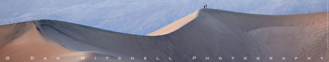
There are, of course, quite a few worthy photographic icons in Death Valley. Zabriskie Point is a classic dawn subject and if you haven’t shot it before, you should. The salt flats around Badwater are also renowned for good reason – they can also be a morning subject or a late afternoon or evening subject. The Mesquite Dunes (near Stovepipe Wells) are a fine subject both morning and evening. Canyons can work well a bit later in the morning or earlier in the afternoon. As for the less-known places, two quick thoughts. Begin your discovery of this park with the familiar and quite compelling icons – they are icons for a reason. Then, as your knowledge of and passion for this park increases, begin to push back the boundaries and look for those places that only reveal themselves over time.
Keep in mind that DEVA is a huge place, and photographing a wide range of subjects often entails a lot of driving, some of it on rough roads. It isn’t a bad idea to think carefully about how to organize some of your subjects to accommodate driving time.
I know that isn’t even close to the whole story, but I hope it helps you as you begin your long-term acquaintance with this huge and varied and beautiful place.
 G Dan Mitchell is a California photographer and visual opportunist whose subjects include the Pacific coast, redwood forests, central California oak/grasslands, the Sierra Nevada, California deserts, urban landscapes, night photography, and more.
Blog | About | Flickr | Twitter | Facebook | Google+ | 500px.com | LinkedIn | Email
Text, photographs, and other media are © Copyright G Dan Mitchell (or others when indicated) and are not in the public domain and may not be used on websites, blogs, or in other media without advance permission from G Dan Mitchell.
Thanks very much for the information. Actually the calibration software
suggested by Aspen Creek was helpful, I think I just need to experiment with editing more to the prints rather than the screen.
Kent